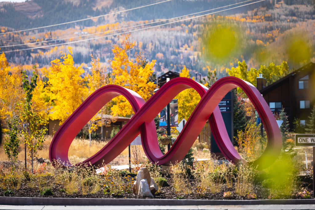
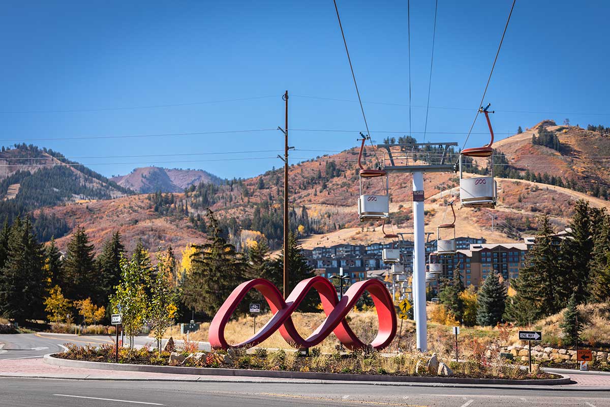
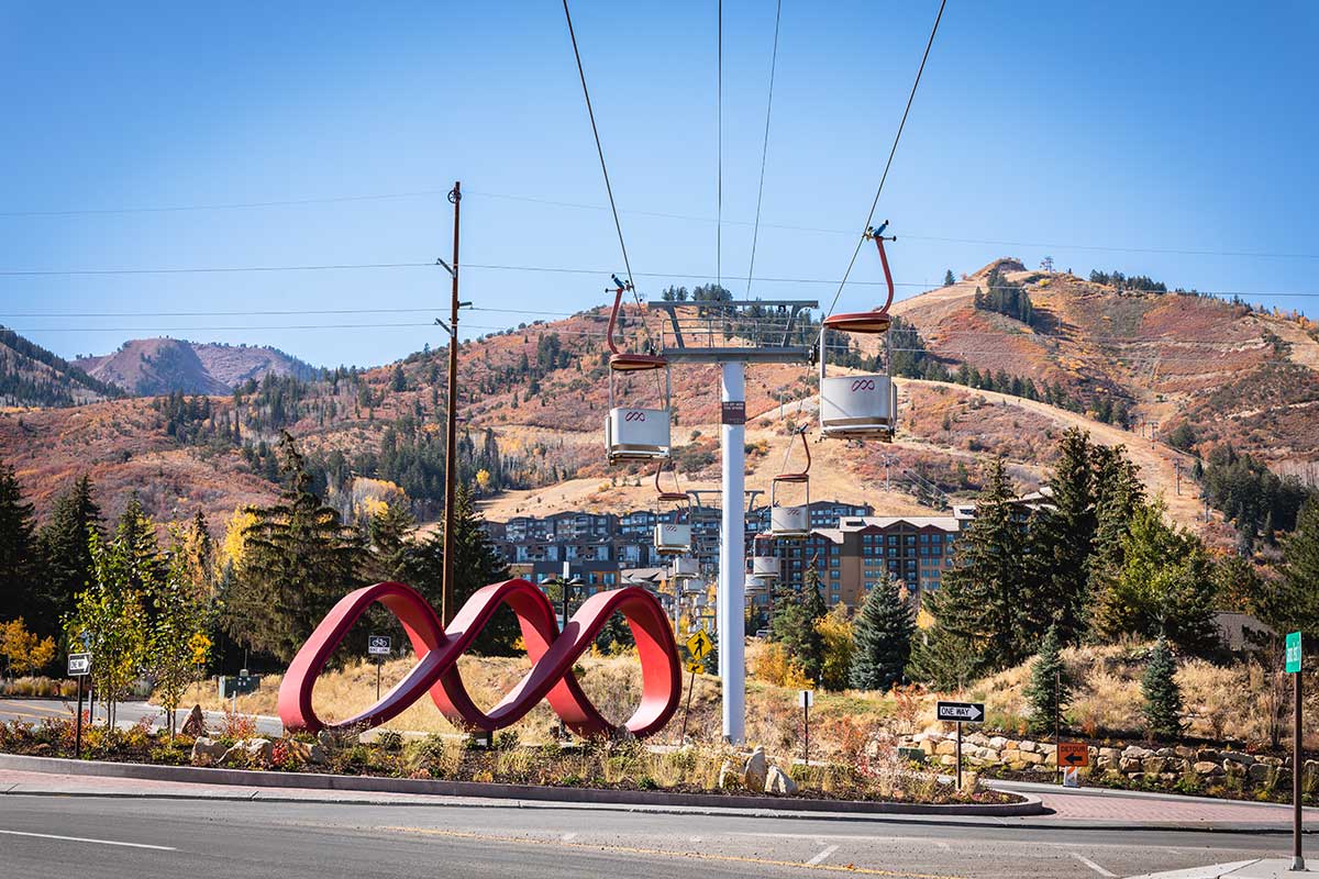
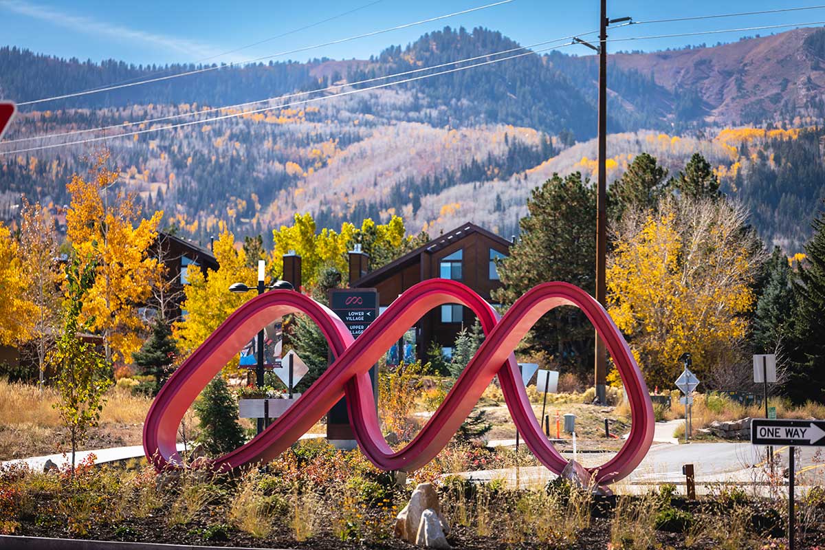
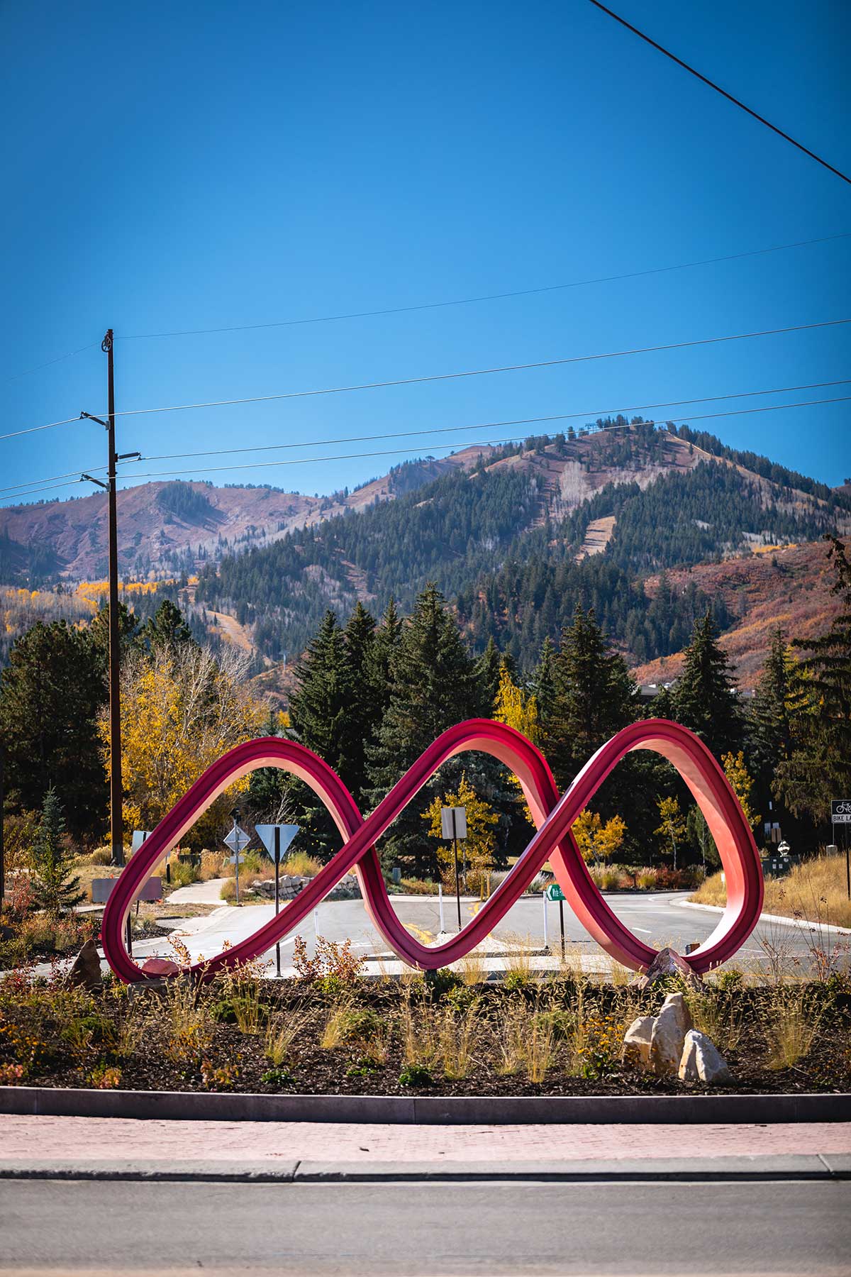
You may have noticed The Ribbon—a striking 3D installation by Harris 3D Studio—while driving into Canyons Village. This sculptural piece brings the Park City Mountain logo to life in an entirely new way.
About the Park City Mountain / Canyons Village Logo
Park City Mountain is a world-class resort, spanning thousands of acres of majestic terrain and offering endless opportunities for adventure and discovery. Its logo draws inspiration from deep snow tracks, sweeping canyons, rugged mountains, and the bold colors of Utah’s natural landscape. It’s a symbol that captures both the thrill and serenity of the mountain experience.
Bringing the Logo to Life
The idea for this project began with a simple 2D concept: a freestanding version of the Canyons Village Management Association (CVMA) logo at the village roundabout. Early prototypes, however, fell short of capturing the essence of the landscape or the dynamism of the logo. That’s when the team brought in Spencer Harris and his group at Harris 3D Studio for a fresh perspective.
After several days of brainstorming, the team returned with three concepts. The unanimous favorite was what would become The Ribbon: a flowing, dimensional interpretation of the logo that’s as simple as it is intricate. As Brent Albers of Identity Signs put it, “All involved agreed this concept was the one—a simple-yet-complicated rendition of the logo that would greet all visitors that entered the Village. And as they circle the roundabout, the more iconic it becomes. From straight-on, it’s a clean and familiar image. As you move around it, the arcs and slopes reveal something far more complex—an art piece that feels endless in its movement.”
The Creative and Technical Process
Turning this concept into a physical structure was no small feat. The final design had no clear beginning or end, making fabrication particularly challenging. The team began by cutting a few side pieces and carefully forming the shape over the course of 33 days. Design and engineering took an additional 3–4 months to ensure both form and function were perfectly aligned.
From the Designer – Spencer Harris
“This was no easy task,” recalls Harris. “Designing a logo in 2D is one thing. But to dimensionalize it—especially one as elegant and abstract as the Canyons Village logo—is an entirely different challenge. The sweeping curves resemble connected mountain peaks, but every attempt to recreate that in three dimensions felt off. That’s when we realized we needed to simplify. We gave the logo a Mobius-like twist, curving it in and out of itself, and extruded the form to give it volume. What emerged was captivating—new shapes and perspectives appearing as you move around the piece. One of our favorite moments was discovering how much it resembles mountain slopes when viewed from certain angles. It was one of the most demanding pieces we’ve done, but also one of the most rewarding.”